Add A Feature Case Study


Introduction
Problem statement: Users of the Netflix streaming website can find it challenging to find specific movies of interest efficiently and enjoyably.
What: Netflix movie steaming service is a robust website with many features but it could use movie filters to find specfic movies quickly and easily.
Why: Although the Netflix UI is clear, it can sometimes feel complicated to find movies for many users who want to find certain movies quickly.
My goal: I was trying to simplify the UI of the Netflix website so that users would have a better and more enjoyable experience. I had to solve for the design before using the filter and after using the filter: how it should look and how many movies should appear on the screen.
How long: 1 Month
I was ready to begin the research phase.
Research
In the first research phase, I began with a comparative analysis chart comparing Netflix with other movie streaming websites "to get a lay of the land" and the typical ways movie websites work:
With that determined, I then chose 5 participants to interview and ask questions concerning Netflix to determine which features they need most.

Questions I asked were:
11) Knowledge: What do you know would make it easier for users of the Netflix steaming service to view movies and navigate pages?
12) What are the major goals of people who watch Netflix movies?
13) What are major frustrations of people who watch Netflix movies?
14) What are major needs of people who watch Netflix movies?
15) What are major motivations of people who watch Netflix movies?
I could already see from their responses that Netflix could benefit from a way to give users greater agility in spotting out specifc movies of interest.
So I next proceeded to group the interview findings into an affinity map:

Patterns I saw among participants were:
-
They felt that movies should not only be fun and for relaxation, but that they should also teach morally redeeming values as well. One should leave a movie a better person.
-
They felt people watched movies for escapism, enjoyment, excitement, and peace of mind.
-
Participants felt users needed to be able to find a movie easily by a certain movie topic. I was already thinking a filter would best serve this need.
With the knowledge that users perfered a way of finding movies easier, I now started the define phase to further consolidate my insights.
Define
I initatied the define phase by using my previous research to create an imaginary persona of someone who would watch Netflix movies. This would help me further organize the needs of users to determine how the new filter feature would look and function.

The persona helped me to see how a person would need movies to be easily accessable and easy to find to accomplish their needs and goals. I was starting to feel that both a dropdown and a tag filter would be the best way to accomplish this.
I now went to create a Value Proposition Diagram to analyze the individual's goals in contrast to the business goals to see if they aligned well:
The Value Proposition Diagram helped me to realize that both the Netflix streaming service and the user would benefit from a dropdown filter.
I decided next to write out POV and HMW statements to elucadiate the exact problem to myself:
POV
I'd like to explore ways to provide Netflix watchers (user) to be able to filter through movies on the Netflix streaming service website (need), because there is a large array of movie on Netflix and it can be challenging to find a specific one to watch tailored to one’s needs or interests (insight).
HMW
How might we enable Netflix watchers to be able to filter through the many movies on the Netflix streaming service website more efficiently?
With the POV/HMW statements, the solution of creating a dropdown filter was clear to me so I next went to formulate a User Flow to calculate how the dropdown filter would actually work from start to end:

With clarity about the dropdown filter's purpose for the Netflix website and its functionality, I now started drawing out where the the dropdown filter and tag filter would appear on the Netflix page using a lowfidelity wireframe.
Design
Using the previous persona, Venn Diagram, POV/HMW statements, and user flow, I drew out my low- fidelity wireframes:
Using the previous persona, Venn Diagram, POV/HMW statements, and user flow, I drew out my low- fidelity wireframe.


I then turned to Figma to take the sketches and tranform them digitally at a higher level prototype.
An early version that I later discarded:

A later version closer to the final prototype:

The Final prototype had already taken shape and looked nice. In the next phase, I would test these prototypes amongst particpants and make essential changes to my dropdown filter and tag filter within the framework of the Netflix website.
Test
Starting the test phase, I asked 5 particpants to look at my low fidelity prototype and provide feedback.
There was not any major comments mentioned by my partcipants besides general curosity questions so I went ahead to build the dropdown filter and tag filter as a high level prototype in Figma.
After I created the high level fidelity prototype, I returned to the 5 partcipants again and asked them to test the new prototype:
I asked them:
1. Can you filter movies?
2. Can you submit a movie topic?
3. Can you clear a movie topic?
They were able to do so.

They also told me helpful corrections for improvement:
-
Change the category topic words of the top tag filter to be different than the the lower dropdown filter.
-
Choose your own favorite topic categories for interest's sake.
-
Some mentioned changes to the submit button and clear buttons to make them more understandable.
-
The “submit” could be removed from the second page
as the only option needed is “clear” to take one back to the first page.

My Mentor also gave me crucial and insightful feedback:
-
The dropdown filter should have “submit” and “clear” buttons inside the filter.
-
I had to use arrows in the dropdown and have it be a darker grey color.
-
The spacing had to be consistently more between each tag and the height of the top nav bar had to be greater.
-
“Trending now” section was too much space and was pushing all the content down.
-
Integrate the quick filters (tags) in the page, but collapse the search area.
-
List the dropdown alphabetically.
-
Add a dark background to the dropdown to be consistent with Netflix's brand color.
Ultimately, I was able to resolve these challenges.
The High Fidelity was now pristine, polished, and functional. I therefore had concluded.
Conclusion
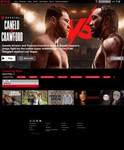
The final High Fidelity looked like this:
 |  |  |  |  |
|---|
This project contributed to my growth as a UX designer in many ways:
It helped me to analyze the needs of commercial websites like the Netflix movie streaming website and their users.
This project allowed me to learn how to create new features that would satisfy those needs.
In addition, I worked on sharpening my skills in Figma through duplicating the Netflix website and adjusting elements.
I learned how to add shapes and components with auto layout when recreating the Netflix website with new features.
The thing I enjoyed most about this project was designing new concepts and features that would benefit the Netflix streaming website and its users.
I enjoyed creating the dropdown filter and contemplating what aspects of it work well with users and their needs.
I enjoyed creating the first page before the movie filter was applied and designing the next page once a specific movie option was applied.
I enjoyed being creative and “thinking outside the box” to solve day to day problems experienced by Netflix users.

To view final website animation, click here:
The final design was a specialized filter created for the Netflix movie streaming website instilling efficiency and enjoyment for the user!